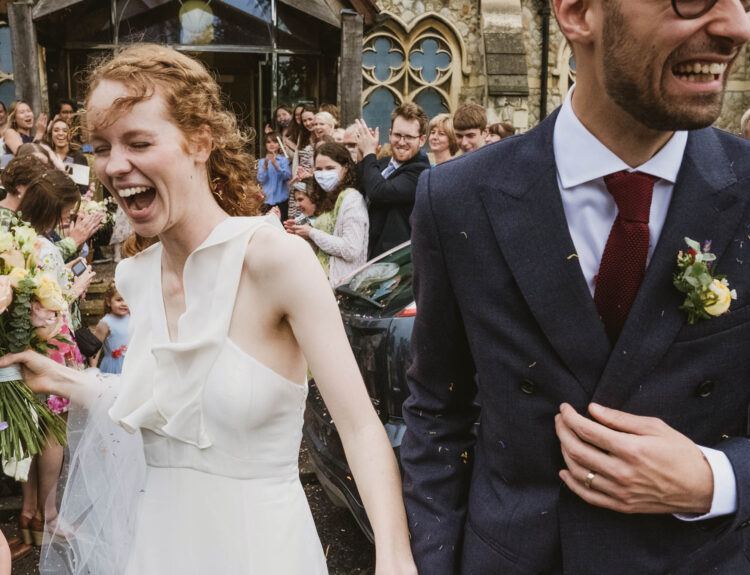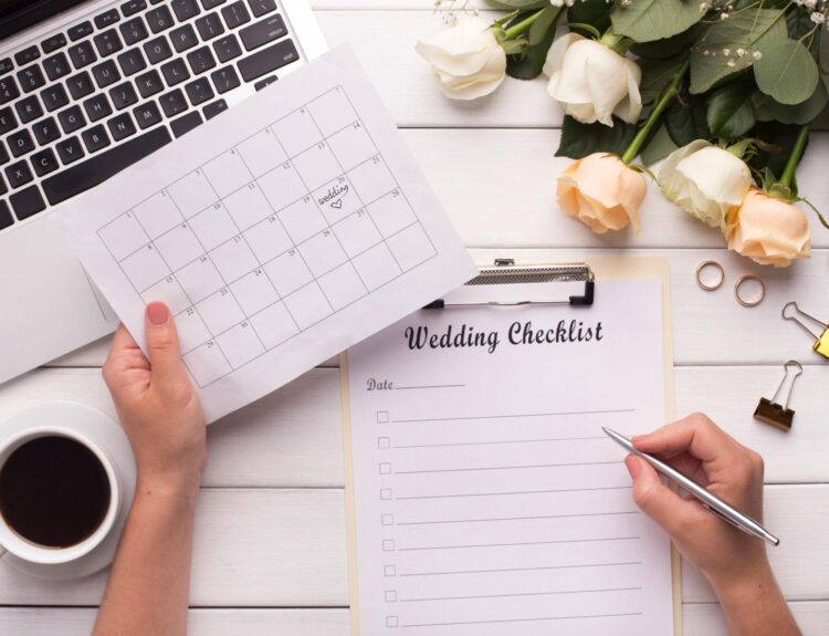

Wedding stationery — invitations, save-the-dates, and reply cards — are more than just their names imply; they’re meant to commemorate your big day and make the process of sending them out easier on you, your guests, and your loved ones. With this in mind, it’s important to get your wedding stationery as perfect as possible before you go any further with designing the rest of your wedding materials. Here are five design tips to keep in mind when creating the perfect wedding stationery that will have everyone talking about how much they love it.
1) Avoid flowers or hearts
When it comes to your wedding stationery, you want to avoid anything too cutesy or clichéd like flowers or hearts. Instead, opt for something more unique and personal to you as a couple. You can include pictures of places that are special to the two of you or use fonts that represent each other’s personalities.
There’s no limit to what you can do. One tip is to look at nature: a tree trunk with leaves cascading down from it could be an awesome design choice. Alternatively, take inspiration from architecture or travel destinations. If you’re getting married in New York City, try creating envelopes with an Empire State Building pattern on them.
Whatever you decide on, remember to stay away from anything that might seem generic; by using personalized details and being creative in your design choices, you’ll really set yourself apart from everyone else out there.
Just keep in mind that you don’t have to stick to the same theme throughout all of your stationery. Depending on the season, location, and occasion, you can choose different designs for different pieces (like menus) without going overboard. It’s totally up to you.
2) Choose clean typography and simple designs
When it comes to wedding invitations, less is definitely more. Choose clean typography and simple designs to avoid overwhelming your guests with too much information. Stick to a neutral color palette. You want your stationery to look timeless, so steer clear of trendy colors or patterns.
Keep the overall design of your stationery suite cohesive. Your invitations, save-the-dates, and thank you cards should all coordinate with one another. Use high-quality paper stock for a luxurious feel.
Have your stationery professionally printed for a polished look. It’s worth investing in custom letterpress printing, which uses hot metal type to create raised surfaces on the lettering. It’s an expensive option, but these types of printings are typically eye-catching and can be used on anything from an invitation card to a save-the-date card.
If you’re on a budget, consider having your stationery printed digitally instead. With digital printing, each piece is laser-etched onto a special film that’s then put through ink jets to produce crisp lines and vibrant colors. What’s most important is that the end result has a professional look without costing you more than necessary.
3) Don’t copy other wedding stationery
It can be tempting to find a design you love and simply copy it, but your wedding stationery should be unique to you and your partner. If you’re not sure where to start, try looking for inspiration in nature, art, or your favorite colors.
You could also take some time to think about the important moments of your relationship, like meeting each other’s parents or proposing on the Eiffel Tower. Your memories will create an emotional connection that makes all the difference in the end result. Don’t overwhelm yourself:
A few simple pieces of well-designed wedding stationery are often more effective than multiple complex ones. Start with a save-the-date card, followed by invitations and save-the-date cards. These three pieces should set the tone for the rest of your stationery suite and help people feel excited about coming to celebrate with you.
Make it personal: When you get married, things are changing in your life. So why shouldn’t your stationery? Use these design tips as an opportunity to reflect how far you’ve come together as partners by incorporating personal touches like hand lettering or pictures from trips abroad.
4) Balance simplicity with detail
Your wedding stationery is one of the first things your guests will see, so you want to make sure it sets the tone for your big day. Balance simplicity with detail to create a design that’s eye-catching and memorable.
The best way to do this is by using a monochromatic color scheme and varying line thicknesses and weights. For example, if you’re designing save-the-dates cards, keep the font simple but elegant and vary the weight of the lines in each letterform to create contrast.
If you’re designing envelopes or invitations, go for clean lines with bold geometric shapes (like hearts) as accents rather than including too many details on each individual piece—no one wants to spend their time trying to decipher what’s written.
You can also add texture to your invitation with embossing or foil stamping. A shimmery metallic ink paired with a simple typestyle creates an impactful effect without being too flashy.
5) Match your stationery to your theme
Your wedding stationery is one of the first things guests will see, so it’s important to make sure it matches your wedding theme. Consider these design tips when choosing what colors and fonts to use:
First, think about your invitation wording. Do you want a formal or informal feel? If you want a formal feel, go with dark colors such as black and deep reds; if you want an informal feel, go with lighter colors such as bright blues and yellows.
You can also have contrasting lettering for a formal feel (such as black writing on white paper) or similar lettering for an informal feel (such as light blue writing on light blue paper). Next, think about the style of fonts you want to use- this could be something modern like script font or something more traditional like Times New Roman.
Script fonts are great for giving your invitation a casual, fun vibe while Times New Roman gives off a more elegant tone. Third, consider the size of your invitations. If you want something small that looks great on an envelope liner, choose a smaller typeface and trim down the margins. However, if you’re looking for bigger typefaces that stand out from afar then go big with bold letters and wide margins.
Fourth, make sure there is ample space between lines to accommodate longer words or sentences by adjusting line spacing in Microsoft Word. Finally, don’t forget to review color combos before finalizing everything. Just because two colors look good together doesn’t mean they’ll look good together on your card stock.